Showing posts with label Color. Show all posts

Tuesday, October 16, 2012

Anne Bagby & Lynne Perrella - Clown Workshop

It was my over-the-top-LUCKY day when I learned Anne Bagby and Lynne Perrella were coming to my island (little, remote San Juan Island) to teach a 4-day workshop! Their theme was clowns... they would alternate teaching, two days each.


I've taken classes from both of them previously (at Art Fest), learning much of what I know about painting with acrylics and collage from them. I've incorporated painted, decorative papers into all of my beaded books. Above all, I owe to them the techniques of layering and glazing.

I want to write more posts about the workshop, which just finished yesterday, and show some of the teachers' and other students' work. But for today, I'm just going to show my own work.

Day 1

Anne taught some methods for drawing faces, and how to alter a picture of a face (perhaps taken from a magazine) to suggest a clown's face. We used white oil markers to make the faces white. I had two types. The whiter face was done with a Sharpie marker. Some of the other students used color pencils to shade the faces and make them look realistic. Since I've never even attempted to draw a face, I just stuck to outlines this time. But I envied the more realistic look.

Clown with Beard
Using painted 5x7 canvases, we collaged papers over the surface as a background for our "clowns." On other canvases, we simply sponged paint on the surface to give it a more complex look.

Lee and Madeline
We cut a "lump" out of painted papers from our stash (or Anne's stash) for the body, and used matte medium to attach it to the canvas.

Clown with Red Hat
Finally we added the face. To complete the pictures some students added ephemera, such as lace, buttons, etc. to make them more clown-like.

Babushka
 I chose to keep them simple, but did glaze most of them to soften the look.

Day 2

Lynne taught how to work with a toner-copy of a photograph, how to make it our own using her new favorite medium, Portfolio brand water soluble oil pastels (24-colors). She showed us how to cut stencils and masks to enable coloring in certain areas and to make lines like the shoulders on my painting below.

Alfred Tomkin
Using gel medium we attached our pastel-worked faces on 8 x 10 canvas boards, which in my case, were pre-painted. Lynne showed us how to collage papers and work with paint and/or pastel layers to integrate the faces with the background. Since my face images were face only (no neck, shoulder, or body), I had to create those parts with paint and pastels.

Lilly Tomkin
The images I used were family photos - my great grandmother, Lilly Tomkin, and great grandfather, Alfred Tomkin. I never knew them, but always loved these pictures of them. I just couldn't make them into clownish, clowns. So I just suggested the clown idea with colors and the use of the diamonds (harlequin) motif, while trying to preserve the dignified portrait look.

 Day 3

Anne taught four different methods for creating masks and stencils of figures. She also taught us how to make complex papers, which are collages of various painted papers, used then as a single sheet of painted paper. Her work using these methods is phenomenal (as you'll see in a future post), but I struggled hugely this day.

Cab Calloway
We were supposed to do four figures. I only did one. His face is one I drew on day 1... again, I wished I knew how to shade the features. One student was using water soluble pencils to shade her work, and the results were stunning.

A problem for me was that I couldn't find a way to relate, personally, to the faces and figures, to care about them, to find meaning in doing them. This one, for example, didn't have meaning for me until last evening when I showed it to my husband. He said it reminded him of the musician, Cab Calloway. OK... now I like it better.

Day 4

Lynne worked with us to pull it all together... everything we learned in the previous three days. The project was to make a vertical or horizontal panel with several faces.

Directors
What fun it was to turn a photo of my husband, our Siamese cat, and my grandmother into a painted-collaged piece! I call it "Directors," because these are three influences that in different ways direct my life journey. The night before, I re-read favorite chapters in one of my favorite books, "Improv Wisdom," by Patricia Ryan Madson. Brilliant! It really freed me to have fun, to play, to let go of "doing it right." I love the results!

More pictures from the class soon. Don't forget, you can click on Lilly and Alfred (day 2) to enlarge and see more details.

Wednesday, August 01, 2012

Natural Dye Day & Bundle Bash


Fabric dying is a love-hate sort of thing for me. I'm always attracted to felt and fabrics dyed by other people, especially Christi over at Sweet Pea Path. I get all excited about trying it, and take classes or experiment on my own. But the total unpredictability of it, the incredible number of variables that can throw the results one way or another, seems overwhelming sometimes. In the end, there's a daunting amount one needs to learn from others (like India Flint) and by experimenting PLUS lots of luck before one can expect to get pleasing results.

Still... when opportunity comes along, I always jump right in again....

This time, a group of Lopez Island fiber artists experimenting with shibori invited me to join them for a natural-dye play-day! We met July 13th, each bringing plant materials, fabrics and dye pots of various metals.


Here's my basket o' goodies: drift wood for wrapping the bundles, madrona leaves and bark, a bunch of flowers, leaves, berries, and some lichen. Being new at this, I didn't have a clue what might produce color on the fabrics. Fortunately other participants brought botanicals known to work.


Here's my stash of fabrics, all torn from used clothes purchased at our thrift store. Mostly it's linen, with a few pieces of cotton and silk. I boiled the linen and cotton fabrics in water + alum to pre-mordant them, making the fibers more receptive to taking color.


The thing that looks like a washcloth is blended cotton/silk yarn that I knit into this swatch. I threw it into the mordant bath as well. This is what I unraveled and used to wrap/tie all of my bundles, knowing it would take dye too (you'll see further down)!


Here are a few other things I planed to include in my bundles - rusty nails and washers, copper spirals, and tyvek tags for noting what I put in each bundle and what dye treatment it received.


And these are packets of spices - turmeric,  curry, cayenne, paprika, and yellow mustard. Why not give them a try too?


After wrapping our bundles, we put them in one of several dye pots. One was just a steam bath. Others included boiling mullein, boiling eucalyptus leaves, hot tansy ragwort, and cold berberis. The picture above shows my bundles after being in the dye or steam bath for an hour or two.


Then came the waiting and the mildew.  The bundles need to cure as long as possible. We decided to have a Bundle Bash, a grand opening of our collective bundles, on July 30. We agreed not to open the bundles until them. A problem developed with some of them... they started growing mold... black spots/areas, especially on the underside of the bundles. A second steam bath halted the growing, and a very slow bake in the oven to hasten drying seemed to prevent new growth.


So here we are two days ago, gathered like kids at Christmas, unwrapping our bundles, hard pressed to take even one moment to hold up a sample for the picture.


Here's a picture of all of mine. They need to continue curing for at least another week. Then I'll dip them in salt water (hoping to further enhance the colors) and let them air dry. Finally, after all that, I can wash/iron them, and see what they REALLY look like.

As I look at them together like this, they seem so muddy, so similar to old paint rags or maybe fabric scraps from making costumes for an end-of-the-world zombie movie. Harsh words, I know. That's what I mean by love-hate relationship.

On the love side, some of them, some parts of them, have potential. For what? I'm not sure... some sort of quilted, hand stitched fiber art, I guess.


This is the one made with the spices. It's the only bright one that I made, and it's much brighter than anything anybody else made. The fabric is silk and the dye bath was just steam. Obviously color from spices has potential. I'm thinking it could be sprinkled over leaves or other resist objects to leave patterns of un-dyed fabric showing. Hmmm... that's one to try!


This one is madrona leaves and rusty nails/washers on linen. The dye bath was tansy ragwort.


This one is eucalyptus and mullein leaves in a eucalyptus bath cooked in an iron pot. The fabric was some that Christi gave me; I think it's raw silk. I was surprised and pleased with the green color of the prints made by the eucalyptus leaves.


This one is clematis, lichen, and copper spirals wrapped with a pale lavender linen in a berberis bath. The clematis and lichen didn't seem to give very much color. But the mildew made some nice marks, don't you think?!


Lastly, here is the yarn I used to wrap the bundles. I expect this will be quite fun to use!

A lot of time and work went into getting this far. Is it worth it? I don't know yet.  But I can say this... I'm eagerly anticipating giving these a salt water bath next week, so I can get them washed and ironed!!!

....to be continued....

Monday, June 11, 2012

Eyes and BJP update - back to beading!


Thanks everybody for your supportive and helpful comments here and on FB regarding my two eye surgeries. Sometimes I think I'm a big baby... I don't cruise through medical stuff easily the way it seems many others do. For me it was a difficult 6 weeks.

good news
  • my perception of colors and color saturation is dramatically improved
  • I can drive legally without glasses
  • it's my last week of the eye drops routine
  • I can thread needles and bead when wearing highest power reading glasses
not so good news
  • vision in right eye is still a bit blurry
  • still have loss of peripheral vision in left eye
I look forward to seeing the optometrist on Thursday. Hoping that he'll be able to give me a prescription for glasses; that I won't have to have another surgery in right eye; wanting it to be over, to have clear vision at all distances with glasses that I put on in the morning and leave on all day!

OK, enough said about the eyes...  And what was that beadwork above? Well, here's the really good news of this post... Are you ready?  Taaadaaaah....... I've finally started my Bead Journal Project pieces for 2012!!!  I'm 6 months behind, a bit bewildered at the starting gate, yet excited to get moving!


I'm visually journaling about blessings this year in ATC (artist trading card) size. This one is obviously about the blessing of vision. It probably will be solidly beaded, something I haven't done in previous years with my BJP pieces.

More good news! Here's a peek...


My 2011 BJP pieces visually explore my relationship with various people, places, and events in my life. December's BJP is Me and Mountains.  I've always loved the mountains. I recall driving in the hills around Sutter Creek, CA and over the range between San Jose and Santa Cruz as a child - glued to the car window, enthralled!


We moved to Minnesota, where rolling hills and river banks are the mainstays of elevation changes, when I was 7. Returning to the west coast after college, looking for a job and a place to settle, I wandered toward the NW. I'll never forget driving north on I-5 and seeing Mt. Rainier for the first time, one of the greatest thrills of my life! Instantly I knew it was the place I'd been seeking, the place for me.

I've hiked the Wonderland Trail, up and down ridges for 100 or so miles, all the way around Mt. Rainier. For countless happy and peaceful hours, I've hiked trails in the Cascade and Olympic mountain ranges. And countless times, I've rounded a corner to catch an unexpected glimpse of glacier-topped Mt. Rainier or Mt. Baker, gasping aloud at the beauty.


In this piece, the top-left to bottom-right diagonal represents mountains; the other diagonal represents me. Where our paths cross, there is a beautiful trillium, an extraordinarily beautiful, mountain wild-flower! Says it all, don't you think?

I've now completed all of my pieces for the 2011 BJP! Next step is to embroider the subject on each one, stitch them together, and then quilt them into a wall hanging. More on that soon.

Sunday, May 06, 2012

Color Perceptions & Cataracts

lens with cataract sees this ^                           artificial lens sees this ^

cataracts
fast growing kind
went from vision corrected to 20/20 three years ago
to 20/25 two years ago
and last year
to 20/35 in one eye
20/40 in the other eye

cataracts
a month ago rated 3+
on a scale of 1 to 4
4 is legally blind

cataracts
growing over the lenses
darkening, blurring and yellowing vision
brain adjusting as the cataracts progress
until one night
can't see well enough to drive safely
until one day
everything in the grocery store is a blur
indistinguishable blobs on the shelves
until one day
big struggle to thread a needle
even when aided by a lit magnifier

cataracts
surgery different now
not like when Mom had it done
no pain
like in a dream
watching the procedure
from another space-time
a little cut
insert miniature jack hammer
break up the lens
insert miniature vacuum cleaner
remove pieces of lens
flush, flush
insert miniature polishing tool
whir, whir
polish the lens sack
flush, flush
insert artificial lens
pop
spring opens lens
tape cup over eye
all done
go home
eye drops, eye drops, eye drops
four weeks of eye drops
then, finally
miracle
20/20 is restored


lens with cataract sees this ^                           artificial lens sees this ^

OK, you got it. I had cataract surgery four days ago in my left eye. My right eye will be done on May 16th. In the interim, it's the most fascinating thing to close one eye and then the other, alternating between cataract altered vision and "normal" vision. It's totally fascinating to compare color perceptions.

lens with cataract sees this ^                           artificial lens sees this ^

To show the difference, I worked this fountain picture in Photoshop.

One amazing thing about cataracts is that they make any bright light against a dark background have a rainbow halo.  A month ago, I came home totally in awe of the full moon, which was very yellow and had a distinct and bright rainbow halo. I told my husband to go look at the beautiful moon. He came back in and didn't say much. "Did you see that amazing halo?" I asked. He replied, "What halo?" I described it. "I didn't see a halo," he said. "Go look again," I urged. He did, but still didn't see a halo. We both went out and looked, both describing what we saw. Must have been something like the pictures below.

moon as I saw it ^                           moon as Robert saw it ^

Last night there was a full moon again. So, of course, I did the one eye, then the other eye thing on it, making it very clear that everything is in the eye of the beholder. I'm grateful for the chance to have seen a halo surrounding the full moon one last time. And I'm mighty grateful to modern medicine, which by the end of the month will have restored brightness, sharpness and saturated color to both of my eyes!

Friday, January 21, 2011

What Goes With This? The Personality Factor!

The most common question
I'm asked when teaching is,
"What goes with this?"
or
"Which of these beads goes better
with this fabric?"

Don't we all want to know what goes with what? Yep, I think we do. So sit back and play with some fabrics with me. Be prepared, it's a long post (with a lot of pictures), hopefully worth your time!

God's Eye Quilt by Kitty Sorgen
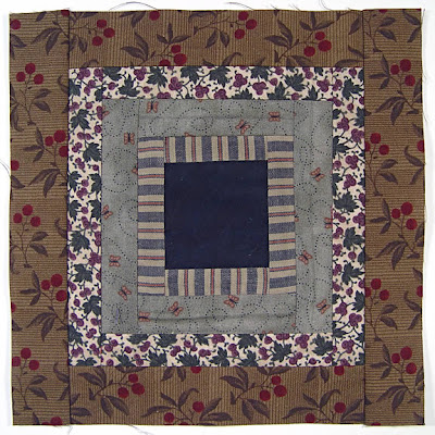
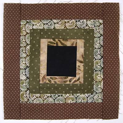
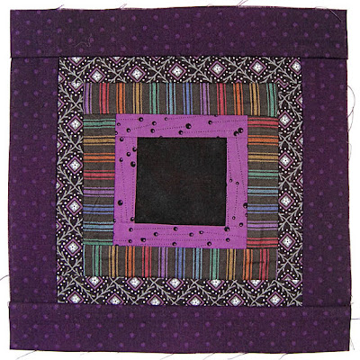
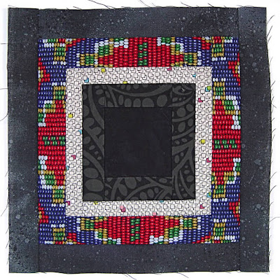
This is a God's Eye quilt made by Kitty Sorgen. Using many little scraps and left over strips of fabric, it carries wonderful memories and invites a warm cuddle. Kitty says the idea comes from the Huichol people of Mexico, who wind yarn around crossed sticks making ornaments which they believe will protect their children. (Here's great a blog post about making beaded, yarn God's Eye ornaments.) Below is a detail of a few of the blocks in Kitty's quilt.
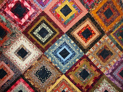

What I love most about Kitty's quilts is the way she puts a little of this with a little of that in such a pleasing way. So, when she offered to teach her God's Eye quilt to our Guild, I instantly registered for the class, not because the technique is difficult (it isn't), but because I wanted to learn everything I could from Kitty about what goes with what! Some of what follows are lessons I learned from Kitty; some are principles I've known for a long time; some are ideas which came to me while making 100 blocks (enough for two large lap quilts) in the past three weeks.

Let's look at a few of these blocks...
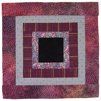
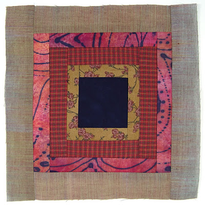
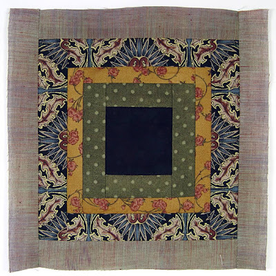
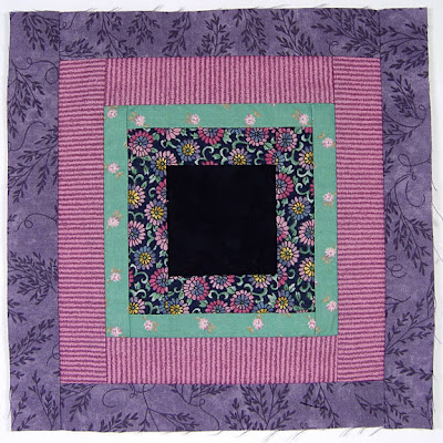
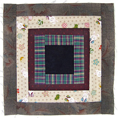
God's Eye Quilt, block 2, by Robin Atkins
God's Eye Quilt, block 3, by Robin Atkins
God's Eye Quilt, block 4, by Robin Atkins
God's Eye Quilt, block 5, by Robin Atkins
God's Eye Quilt, block 6, by Robin Atkins
God's Eye Quilt, block 7, by Robin Atkins
God's Eye Quilt, block 8, by Robin Atkins
God's Eye Quilt, block 9, by Robin Atkins
God's Eye Quilt, block 10, by Robin Atkins
God's Eye Quilt, block 12, by Robin Atkins
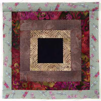
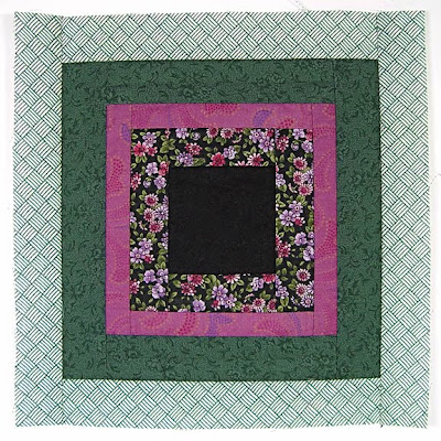
Do you see how each block is a little mini-quilt all by itself? We can look at each one and ask two fundamental questions of design: "What gives it unity and what gives it interest?"

Unity. How do we achieve unity and/or harmony when putting different fabrics together? The surest way is to keep certain things constant. For example:

-type of fabric (ie. all batiks, all quilting cottons, etc.)
-color (ie. single or analogous color schemes)
-scale of patterns printed on fabrics
-subject or theme of patterns printed on fabrics
-value (lightness/darkness as measured on a greyscale)
-one consistent element (ie. black center in each block)

Variety. How do we achieve interest, variety or sparkle when putting different fabrics together? It's easy because there are so many different types, colors, patterns and styles of fabric. One could even put a block together that's basically all the same color, yet achieve interest by changing the scale of the prints. Below is a mostly red block, the varioius scales providing ample variety to make it interesting.
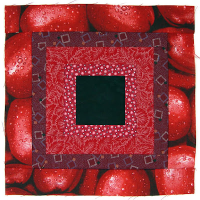
God's Eye Quilt, block 11, by Robin Atkins
Balance. The important point when combining fabrics is this: There must be a pleasing balance between variety and unity. Too much unity and the work will be boring. Too much variety and it will seem chaotic and unsettling.

To play with and learn more about this concept, look at a few of your older works of art, ones you haven't looked at for a while (quilts, jewelry, bead journal projects... whatever). Ask yourself, "What gives this variety? What gives it unity? Am I bored looking at it? Does it make me feel uneasy? Is there a pleasing balance between unity and variety?" Honest answers help us fine-tune our sense of balance for future projects.

Back to God's Eye quilt blocks, the most fun aspect of balance is considering the personality of the fabrics. Think about it! Some fabrics are gentle and sweet, some are bold, some ultra-modern, some very old-fashioned, some sing along harmoniously, some are a bit off-key.

We could conceivably put very different colors and scales of prints together and still have balance if all the fabrics have similar personalities. Below is a good example.
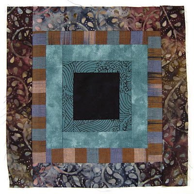
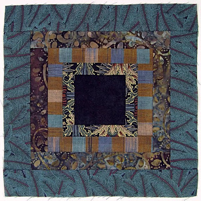
God's Eye Quilt, block 1, by Robin Atkins
All four fabrics are "forest girls," reminding us of things natural and organic... earth, water and plants. Although one fabric is a batik, one a woven stripe, one a plain tone-on-tone and one a quilting print, together they tell a nice little story, united by their common personality traits.

For me, the personality factor overrides all other considerations to the point where I use it almost exclusively in answering the question, "What goes with what?"

For my God's Eye blocks, I think of each fabric as a girl living in a college dormitory. Most importantly, she must get along with the other girls in her room, while also sharing slight commonality with all the other girls in the dorm. If the girls in one room are too much the same, they won't learn and grow from or be stimulated by each other. If they have nothing in common, they'll have problems getting along together.

Below, for example, are the beginnings of 7 blocks. I've selected one girl for each room and a roommate to go with her. I've sewn two sides and am beginning to see how well they get along together (click to enlarge if you like).
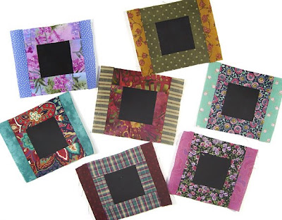
God's Eye quilt by Robin Atkins, auditioning fabrics 1
Here they are again, now with three sides sewn and a clearer idea of their developing friendships.
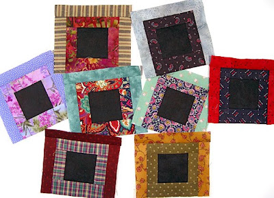
God's Eye quilt by Robin Atkins, auditioning fabrics 2
I like to think about their field of study. For example, at the top left, we have a philosophy major and a math major, both interested in solving problems. Just below (second from left in the second row) we have a boisterous theatre major rooming with a shy gal who studies geology. As opposites, they might be good influences on one another, but they may need a bridge, someone with interests in both their fields, to join them.

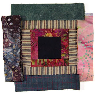
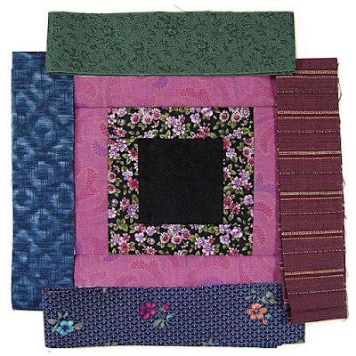
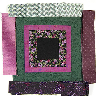
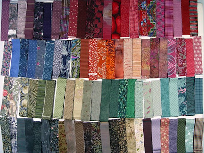
When all four sides are sewn, it's time to audition fabric strips for the third roommate! I pre-cut strips from my stash, using scrap fabrics from my bead journal project pieces from the past three years, most of the quilts I've made, several dance costumes made long ago and fabrics I've bought for spirit dolls, heart pins and other beading projects over the years. Here's a stack of strips.
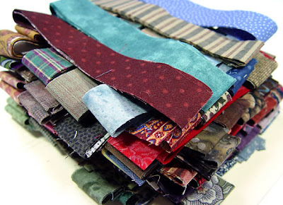
God's Eye quilt by Robin Atkins, auditioning fabrics 3
And here's how they look spread out on the table ready to be auditioned.

God's Eye quilt by Robin Atkins, auditioning fabrics 4
God's Eye quilt by Robin Atkins, auditioning fabrics 9
Above you can see the first two of our gals have narrowed the field to four possibilities for their new roommate. They like the calming influence of Ms Earth Sciences (green) and Ms Horticulture (brown batik). Ms Math major has interests in common with Ms. Computer Programing (grey with red grid), but is concerned that she'll study into the wee hours of the night. Both think Ms. Art is fun, but worry that she might be too messy in the long run. Which do they choose?
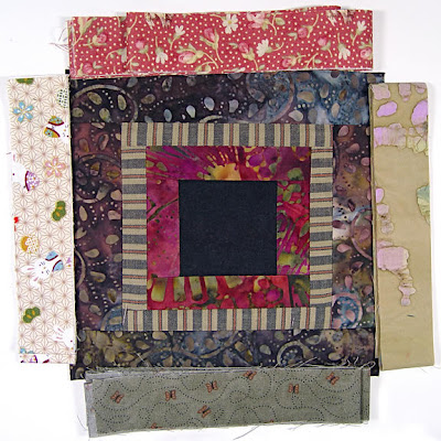
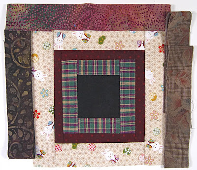
God's Eye quilt by Robin Atkins, auditioning fabrics 10
As you can see above, they chose Ms Horticulture! And now the three of them are auditioning for their fourth and final roommate. Clockwise, from the top, we have Ms Botany, Ms. Environmental Studies, Ms. Entomology and Ms. Asian Studies. Right away, they realize they don't have enough in common with either the right or left possibilities and the choice is narrowed. Although either the top or bottom choice would probably be satisfactory, they pick Ms. Entomology because she has lots of energy, yet is fairly quiet. Below you can see how they look together.
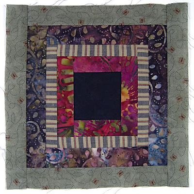
God's Eye quilt by Robin Atkins, auditioning fabrics 11
Kitty likes to talk about the group as a choir, asking if there is a soloist, a duet or if we have a chorus of many voices singing in harmony. Take a look at this next set of auditions and see what choir situation comes to mind.
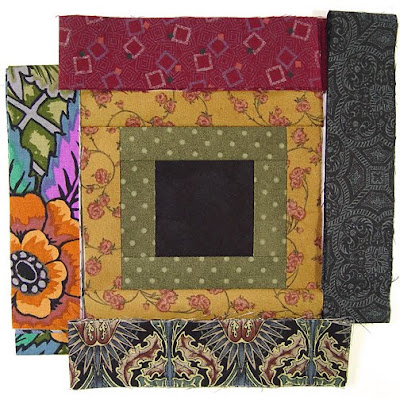
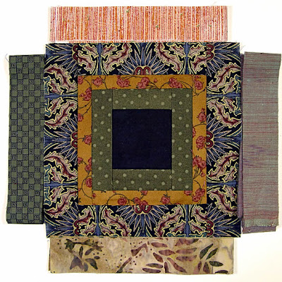
God's Eye quilt by Robin Atkins, auditioning fabrics 15
God's Eye quilt by Robin Atkins, auditioning fabrics 16
God's Eye quilt by Robin Atkins, auditioning fabrics 17
Another way to look at personalities is to think about conversations at a dinner table. One person (the first strips around the black center) talks to the second ring of strips; then a third ring joins them. How does the conversation change? Is one dominating the conversation? Is the conversation interesting? What do they need from the new (fourth ring) participant, a calming influence perhaps, a little sparkle of humor, a brighter point of view? Let's look at another set of auditions below with personality choices based on imagined conversations between the fabrics.
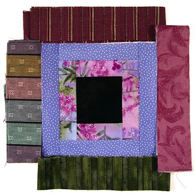
God's Eye quilt by Robin Atkins, auditioning fabrics 5
What conversations are happening above? What does each fabric choice contribute to the already flowing conversation between the first two fabrics? I chose the wide stripes because a little orderly reasoning seemed to compliment the more light-hearted chatting between the first two fabrics and the multi-colors complimented the floral fabric.

Below are the audition strips for the next fabric followed by the four possibilities I thought might join well in the conversation.
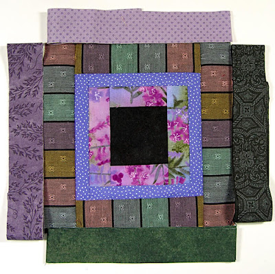
God's Eye quilt by Robin Atkins, auditioning fabrics 6
God's Eye quilt by Robin Atkins, auditioning fabrics 7
What happens with each of the four possibilities for the final conversationalist in the group? How does the conversation change depending on which is selected? Below you can see which one I thought would fit best into the already lively conversation. She's a good listener, don't you think?
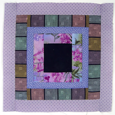
God's Eye quilt by Robin Atkins, auditioning fabrics 8
Just for fun, I'll show you a couple of other auditions. You can look at them as conversations, roommates, a choir or in any way that identifies the personality of each fabric. Try to pick the one you think will work best and then scroll down to see if your choice matches mine.
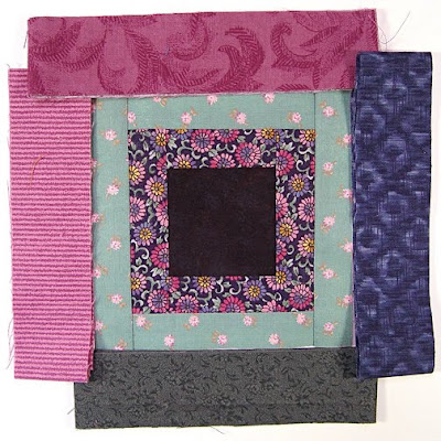
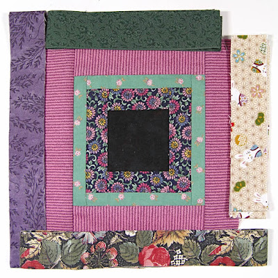
God's Eye quilt by Robin Atkins, auditioning fabrics 18
God's Eye quilt by Robin Atkins, auditioning fabrics 19
God's Eye quilt by Robin Atkins, auditioning fabrics 20
And, two more....

God's Eye Quilt by Robin Atkins, auditioning fabrics 21
God's Eye Quilt by Robin Atkins, auditioning fabrics 22
God's Eye Quilt by Robin Atkins, auditioning fabrics 23

God's Eye Quilt by Robin Atkins, auditioning fabrics 24
God's Eye Quilt by Robin Atkins, auditioning fabrics 25
God's Eye Quilt by Robin Atkins, auditioning fabrics 26
Sometimes the auditioning goes very easily, intuition providing an instant decision, a choice that instinctively feels right. At other times, the process is very sticky, nothing seeming to fit. Below is a choice like that.
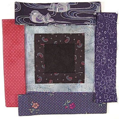
God's Eye quilt by Robin Atkins, auditioning fabrics, 4 choices
The first row of strips is very dark, a Hungarian resist-dyed fabric with a dark indigo background and simple paisley design. The second row is high contrast, a light blue-grey batik. That they are both hand-dyed and both have dot patterns binds them together. What do each of the four possible new fabrics, above, have in common with these two?
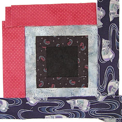
God's Eye quilt by Robin Atkins, auditioning fabrics, 2 choices
Narrowing it down the two above, I still couldn't decide. So I spread each of them around two sides of the block to get a better idea. The pink polka dot fabric seems cheerful and echoes the pink dots of the paisley in the first fabric. The ducks are more subdued yet add a nice sense of flow that compliments both the paisley and the colors of the second batik.
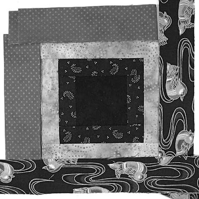
God's Eye quilt by Robin Atkins, auditioning fabrics, grayscale to evaluate value
Sometimes I need to squint at my fabrics to see how the lightness and darkness (value) of them plays out. Removing all color from the picture, you can see that the pink fabric isn't as high a value as you might think from its bright personality, reading as a medium-value fabric.

Deciding the pink was too much sparkle, too dominating, I eliminated it from the running and re-auditioned the fabric printed to look like ikat along with the still-in-the-running duck fabric.
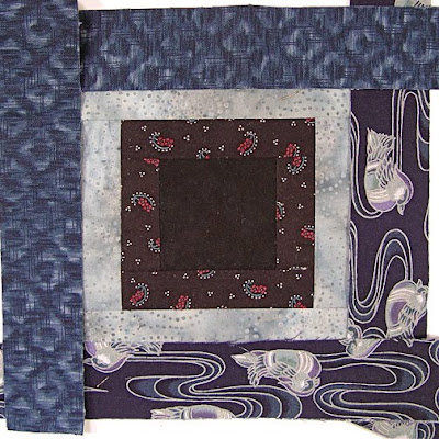
God's Eye quilt by Robin Atkins, auditioning fabrics, 2 choices
And just for kicks, here's how they look through squinty eyes.
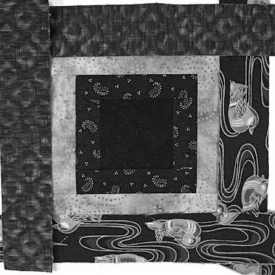
God's Eye quilt by Robin Atkins, auditioning fabrics, grayscale to evaluate value
Which would you choose? Probably either would look fine. However, I decided the ducks provided a necessary link between dark and light, while also adding flow. Below you can see how it looks along with the four possibilities for the final set of strips.
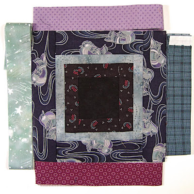
God's Eye quilt by Robin Atkins, auditioning fabrics
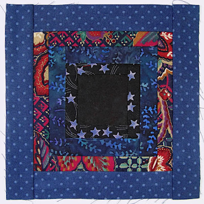
This choice wasn't quite so difficult. Although I think the purple-rose fabric with little rings of dots has circles in common with the first two fabrics, it seems too sweet, two romantic to be comfortable with them. The teal plaid would have been OK, except it seems too sombre with the other two dark fabrics. The light purple talks with the color of the duck's breast, but again seems too sweet, too much of an air-head. Stars, light and fun, lifting the spirits of the dark girls, has to be the one! Here's how it looks, finished...
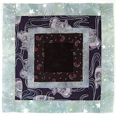
God's Eye quilt by Robin Atkins, auditioning fabrics, finished block

* * * * *
OK, enough about blocks! Now that the roommates are all chosen, we're heading toward the more challenging decisions involving the whole dormitory. Which groups of roommates will be good neighbors?

I'm working on it! Below is a first run assignment sheet for one of my quilts. I plan to look at it pinned on my design wall for several days, checking for rearrangement possibilities.
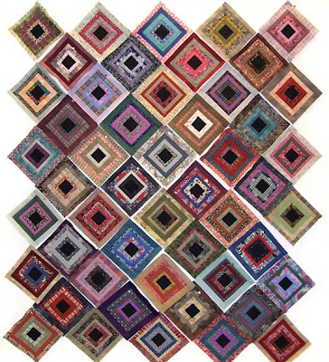
God's Eye Quilt by Robin Atkins, arrangement of 50 blocks, quilt #1
As with individual blocks, it helps to squint at it (and/or look at it through a magnifying glass) to see where the lightest and darkest values are and if they are balanced. Below is the same picture in black and white. Do you think it's balanced yet?
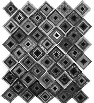
God's Eye Quilt by Robin Atkins, arrangement of 50 blocks, values viewed in grayscale
And below is a possible arrangement of the second group of blocks. Again, it's an on-going process, one that requires a little time and patience.
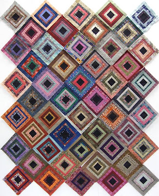
God's Eye Quilt by Robin Atkins, arrangement of 50 blocks, quilt #2

* * * * * *
Sewing these blocks makes me totally happy... I LOVE it! I love cutting the strips and using fabrics and scraps I've had for many years, even decades. I love seeing how, with the addition of each side, the band of fabric around the center closes and joins in the statement of the block. I love auditioning!!!! And I'm loving the process of deciding how the blocks will fit together.

Guess what? I still have more cut strips, enough for one, possibly two, more of these quilts! Since I'm not at all bored with making the blocks, I see another 100 more of them in the near future.

Beads? Yes! I still bead. Working on these blocks has so inspired and invigorated me that I'm back to beading! I'm almost finished with my January Bead Journal Project piece and will post it soon... and you'll see something about it that won't surprise you at all!